What you see is not what you get
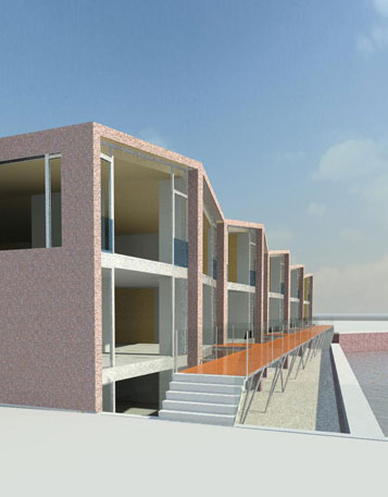
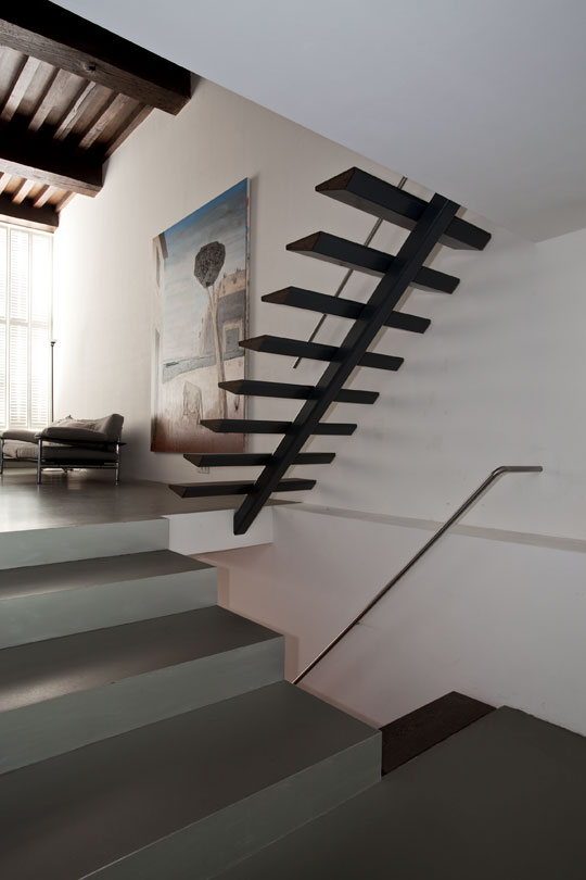
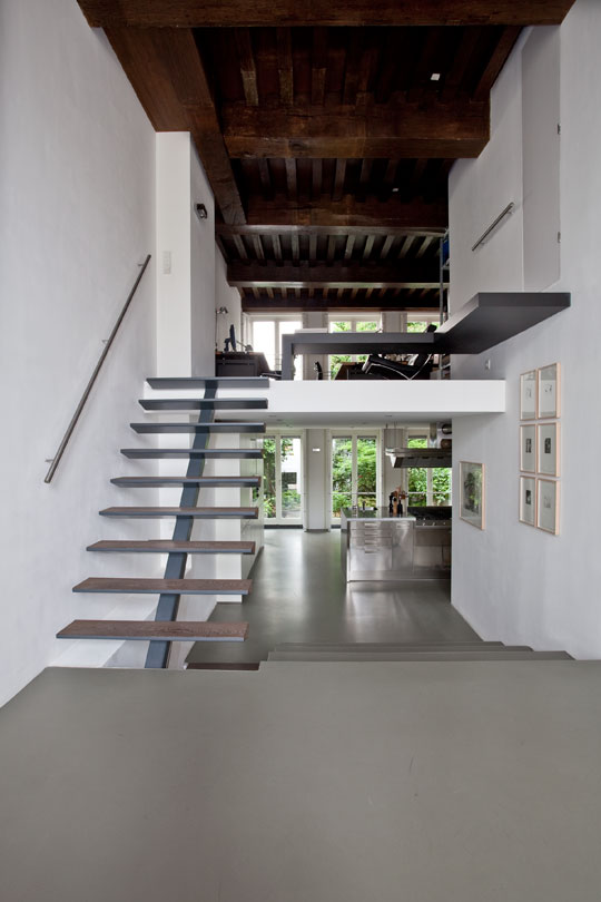
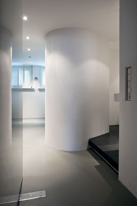
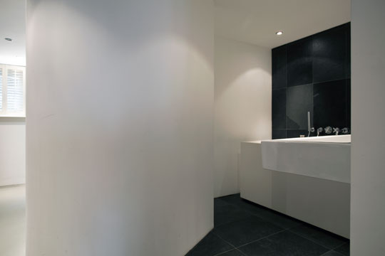
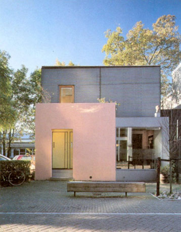
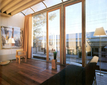
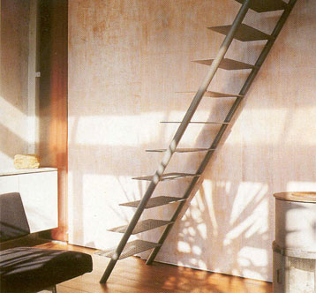
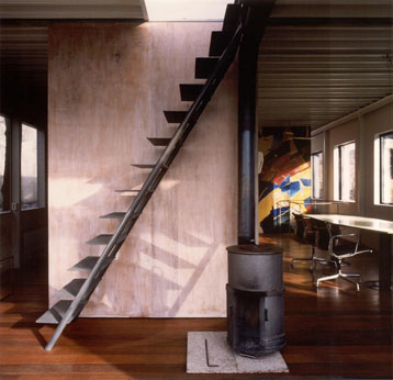
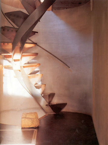
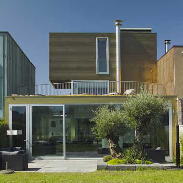
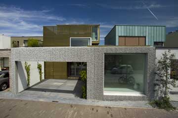
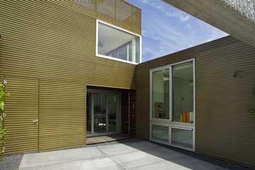
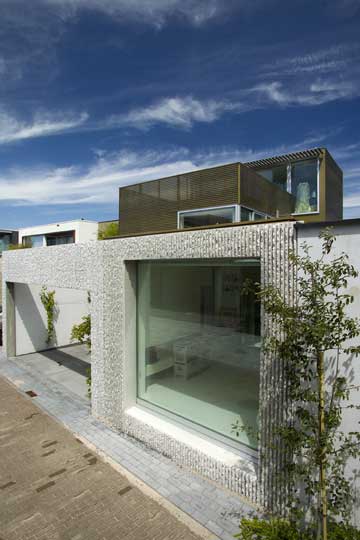
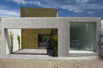
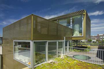
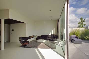
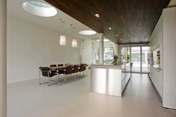
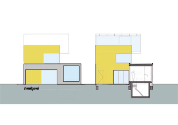
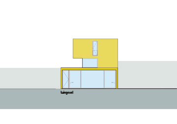
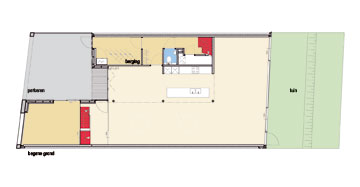
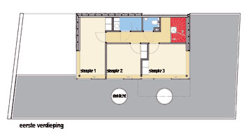
The clients, a family of five, wanted a large house with many rooms, like a kind of maze. The plot is located in a row of modern homes all connected to one another. The result is a 3 storey- tower-like construction; the height compensates for the narrowness of the plot. The staircase acts as a vertebral column. The large floor to ceiling window facing the street allows the interior to relate directly and powerfully with the exterior.
more pictures
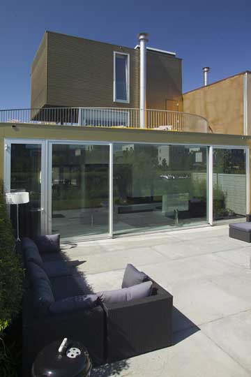
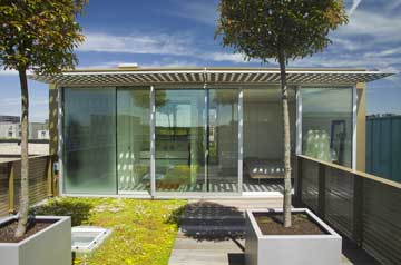
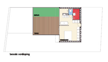
The private terrace on top has panoramic views of the city and the park which makes it a secluded haven of tranquility in a lively residential district.
What a nerve!
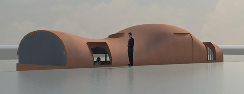
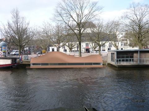
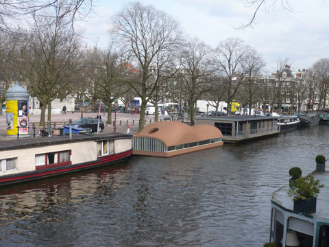
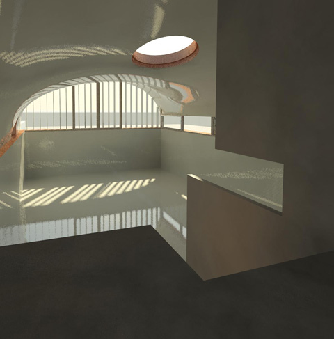
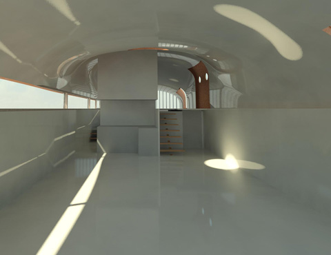
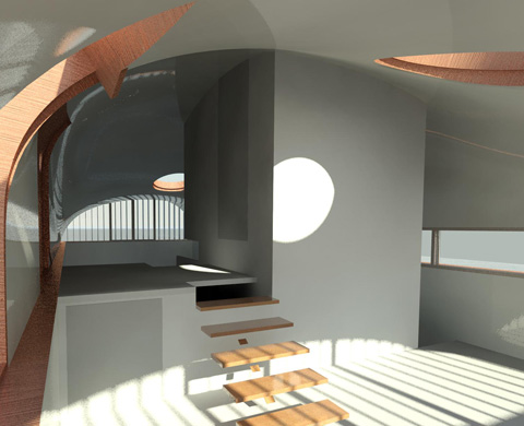
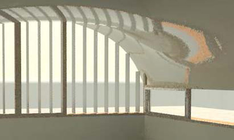
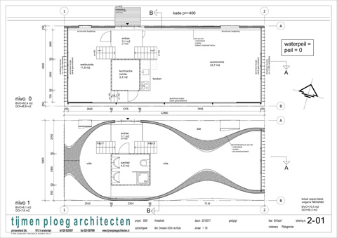
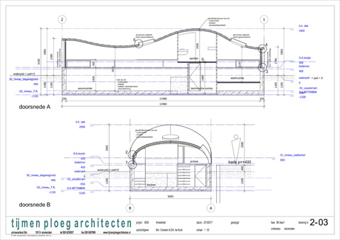
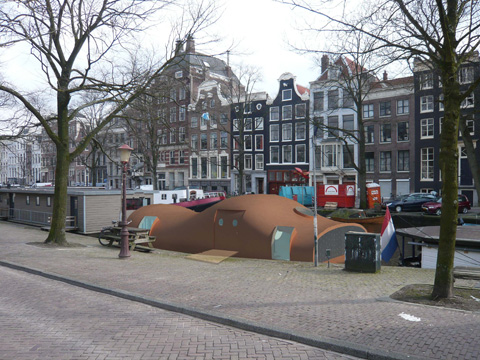
A peanut shaped, rusty boat in the historical centre of Amsterdam. Two levels where contemporary solutions are provided for each different use, within the small amount of space available. This corten-steel project encloses a pure, balanced interior where daylight coming in through windows in the roof and walls encounters white walls to enhance a sense of spaciousness. Rooms are portioned off in accordance with the intended activities. Thus two fundamental objectives were met: privacy and rich spaces.
more pictures
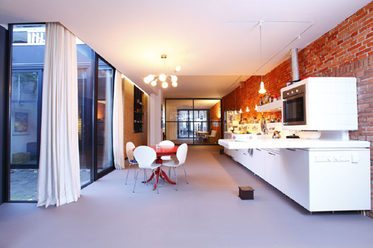
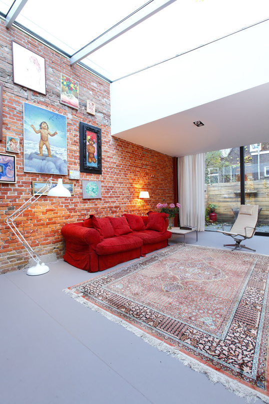
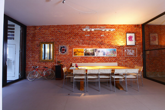
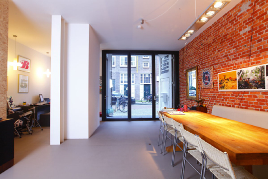
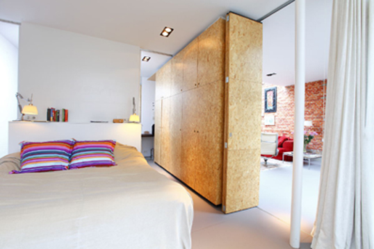
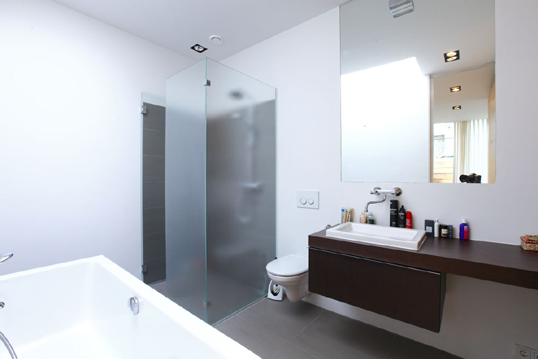
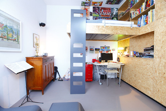
The three bedroom house, with a working space, is located in the centre of Amsterdam. The daylight is realized inby rooflights and a patio. The house is made in a former garage. test
more pictures
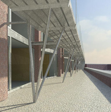
This three storey commercial building is a magnificent example of integration with the historical context. Outside, it presents respectful proportions and dimensions but these hide a contemporary block of offices focused, by way of it’s entrance, on the waterfront. The three floors are vertically related. The terrace on the ground floor creates a space much greater than that of a typical façade. It is a simple and efficient building, an exercise in the quest for what is truly essential in a small size commercial building.
more pictures
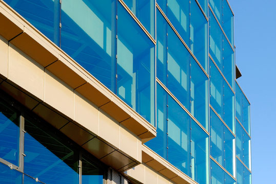
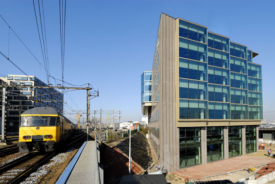
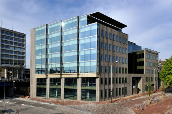
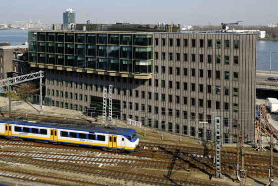
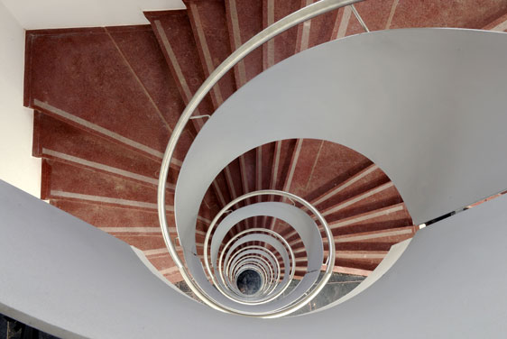
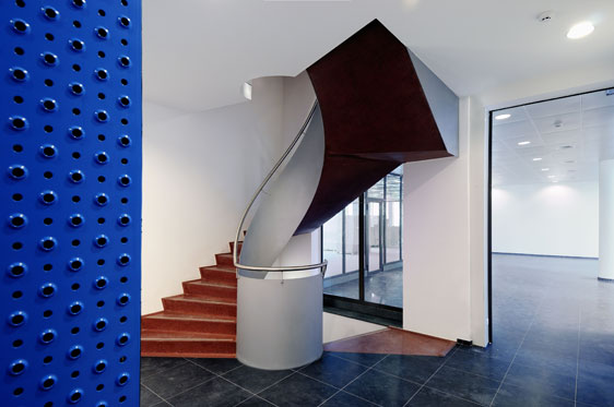
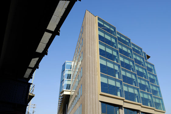
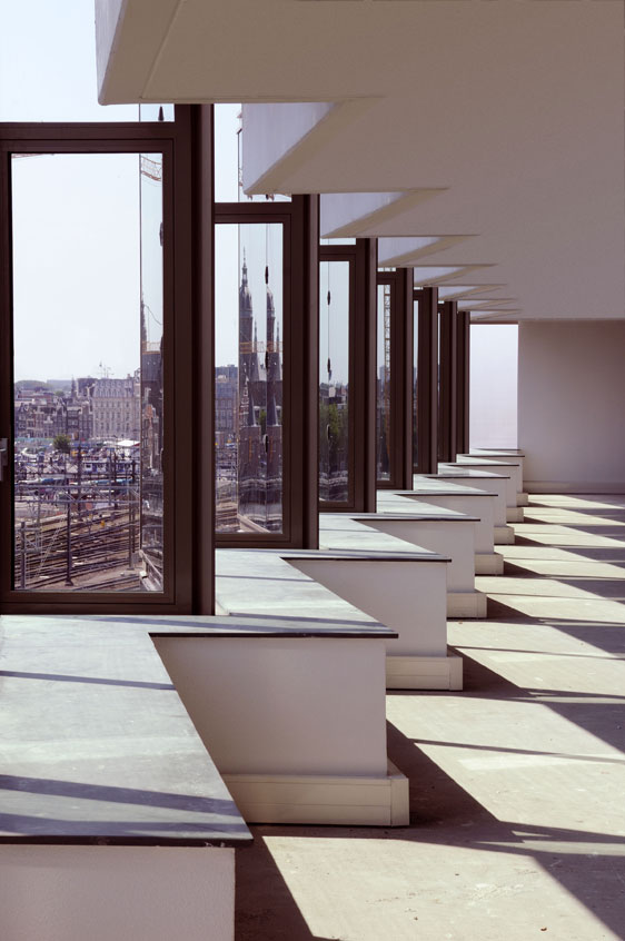
The Office de Ruijter is a seven-story office building. Located near Central Station and overlooking the IJ, it is the gateway to new developments in the area. Its location near the railways has required an innovative and solid isolation. To satisfy this requirement, we have designed a complex structural façade of glass, with windows that can be opened. We propose roughly broken brick walls to correspond with the urban feeling of its surrounding environment.
more pictures
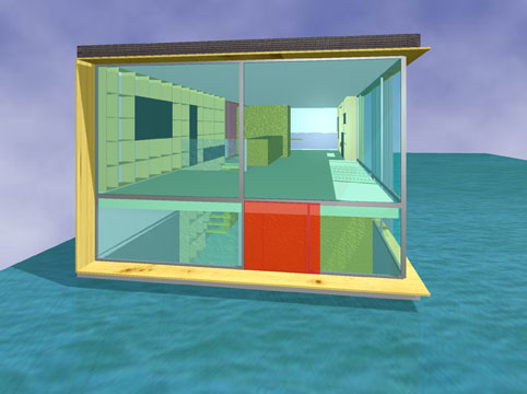
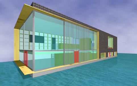
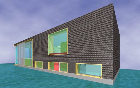
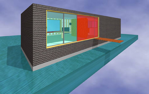
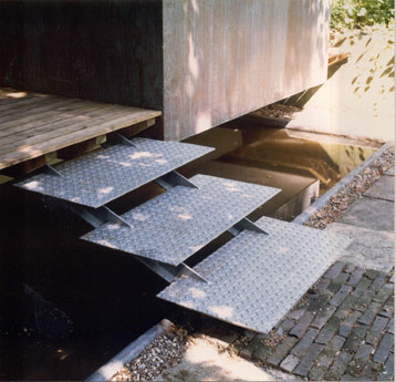
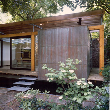
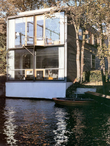
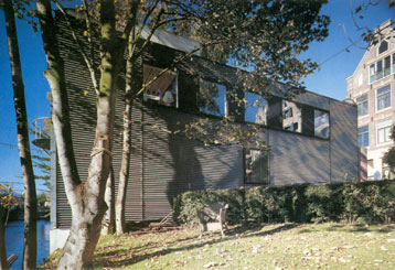
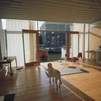
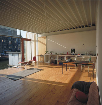
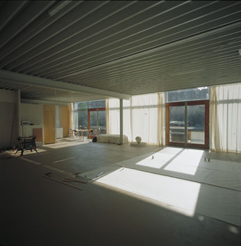
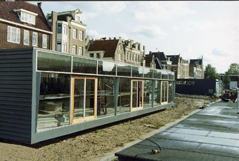
Robust houseboat situated on the outskirts of Amsterdam. The magnificent surroundings have altered little over time. The horizon was always like this. Shelter against the elements sun, wind, rain is found in the sober metal panel and wooden elements. This creates a sensation of solidity, while the large floor- to- ceiling glass panels permit a close relationship with the surroundings. The existing ground level has been brought to live; clearly visible and accessible. The raised ground level is filled with an open, light, spatial content to interact with and merge with its surroundings. Right function on the right spot.
more pictures
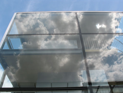
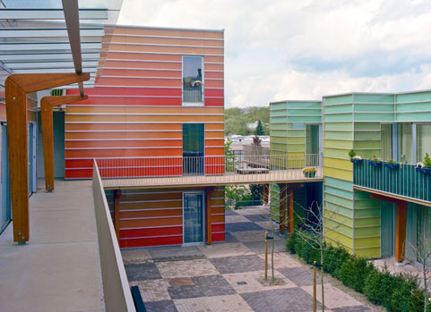
Award winning project!
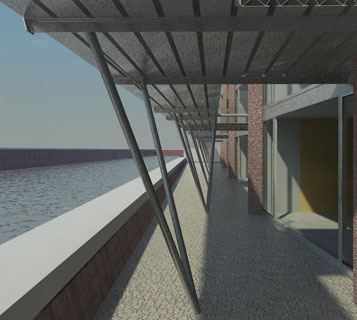
The community consists of 24 units of which 12 are specifically designed for people who are on their way to live independently but not quite there. A meeting place including a communal kitchen as well as a small office are a vital part of the project. The courtyard around which the units are located functions as the public living room.
more pictures
The jury:
“The solid brick facade in combination with the horizontal light influx on the other side of the bricks make for an outstanding combination. The architect has done an outstanding job in understanding the intrinsic quality of the location, in comprehending history and the social structure. His integral approach results in consistent design at all levels. The buildings are conceived and thought of as a whole and are designed with love, from plan to doorknob. And all this within the limited budget so typical of these projects…………”)
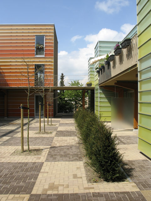
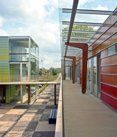
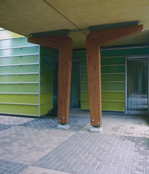
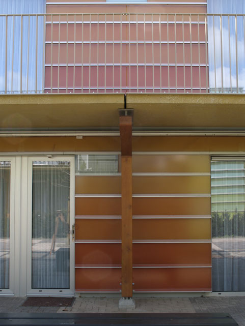
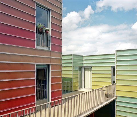
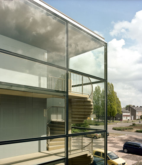
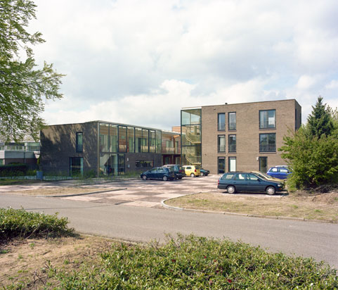
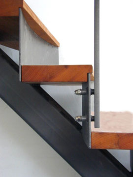
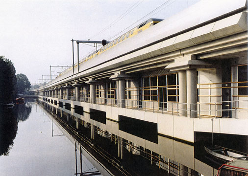
The office building located next to a railway, also functions as a sound barrier between the houses and the railway. The material of the front façade on the railway side is specially designed to absorb sound. The building's entrance is situated on a triangular square on the Nieuwe Teertuinen and has a direct relationship to the studios beneath the railway bridge.
more pictures
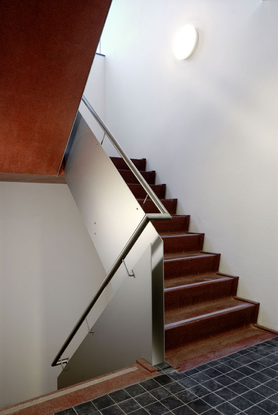
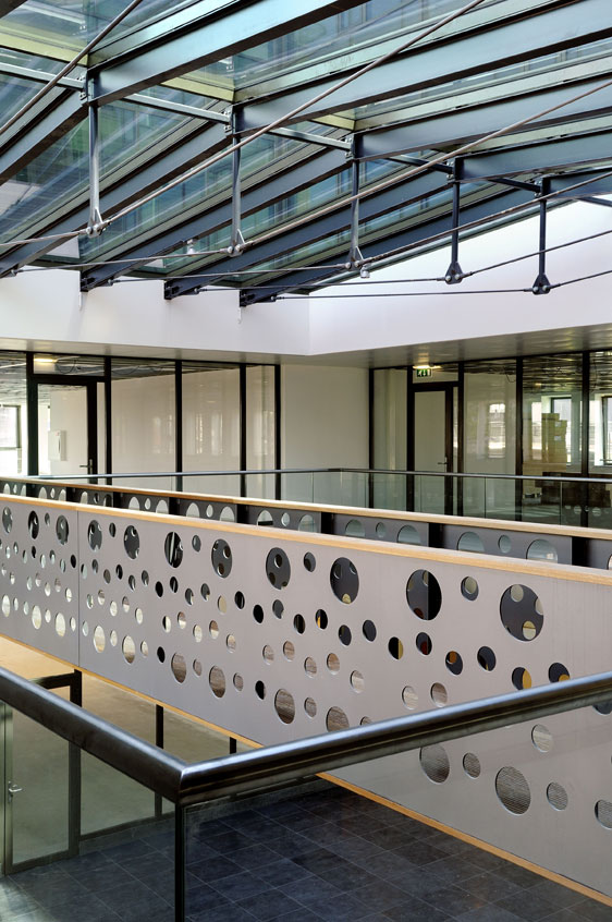
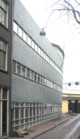
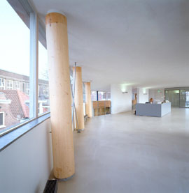
The narrow Sloterdijkstraat is the reason for the façade's appearance. From the ground floor upwards, the façade leans forward and curves towards the side of the railway, opening the small street while providing the interior increased square meters at the same time. The window frames on all floors form an uninterrupted horizontal line which allow for an undisturbed exterior view. Wooden pillars support the concrete floors. There is but one supporting wall, on each of the different office levels, allowing the users freedom to design each space to fit their needs.
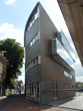
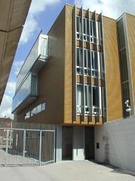
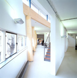
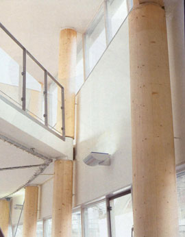
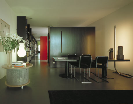
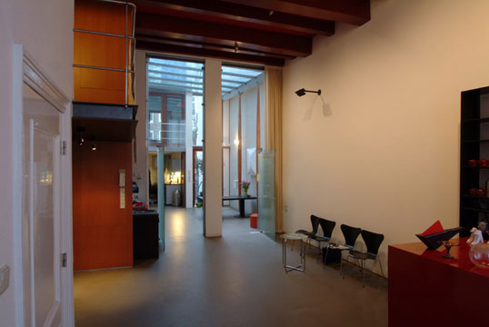
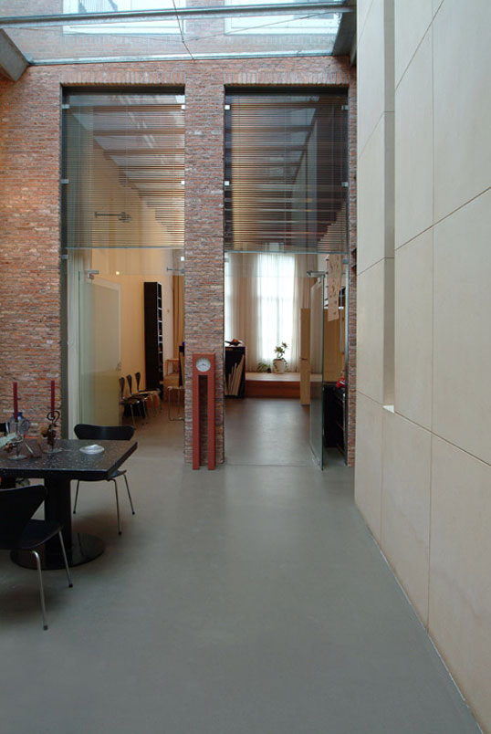
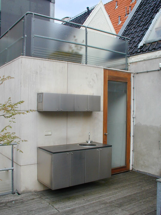
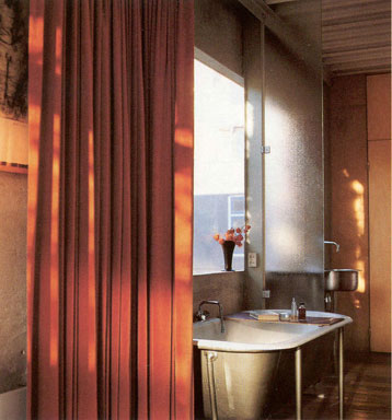
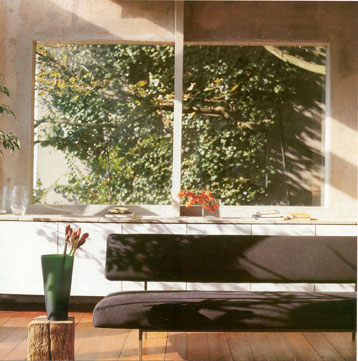
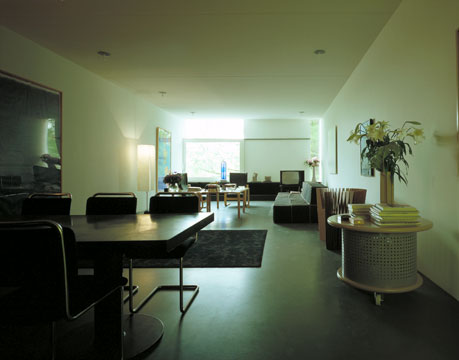
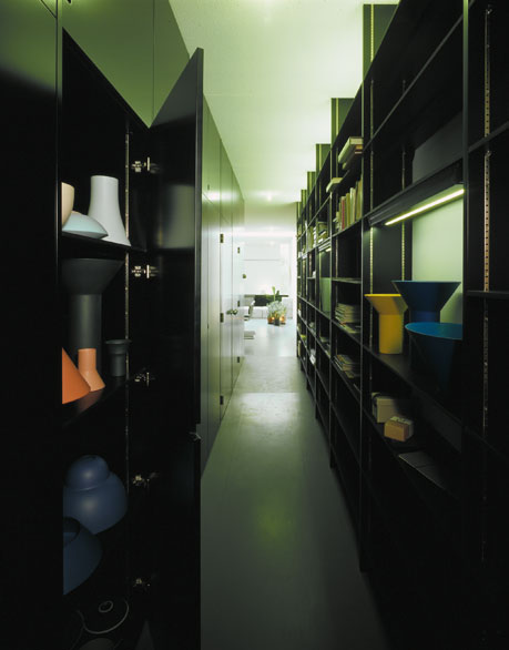
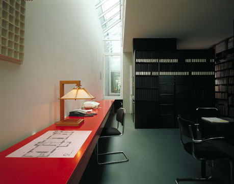
The Premsela Broeksma House replaced a 19th century building located in a 17th century neighborhood of Amsterdam. The house has three separate apartments, a guestroom, an architect's office, a ceramic studio, a garage and a rooftop terrace.
more pictures
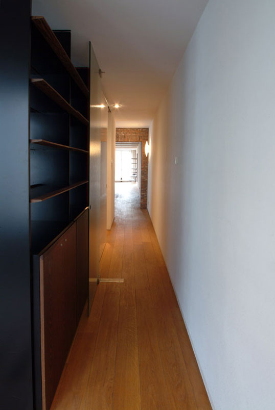
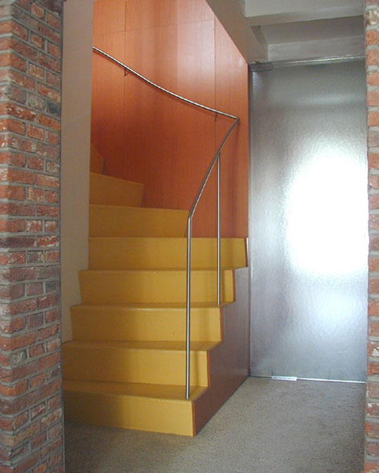
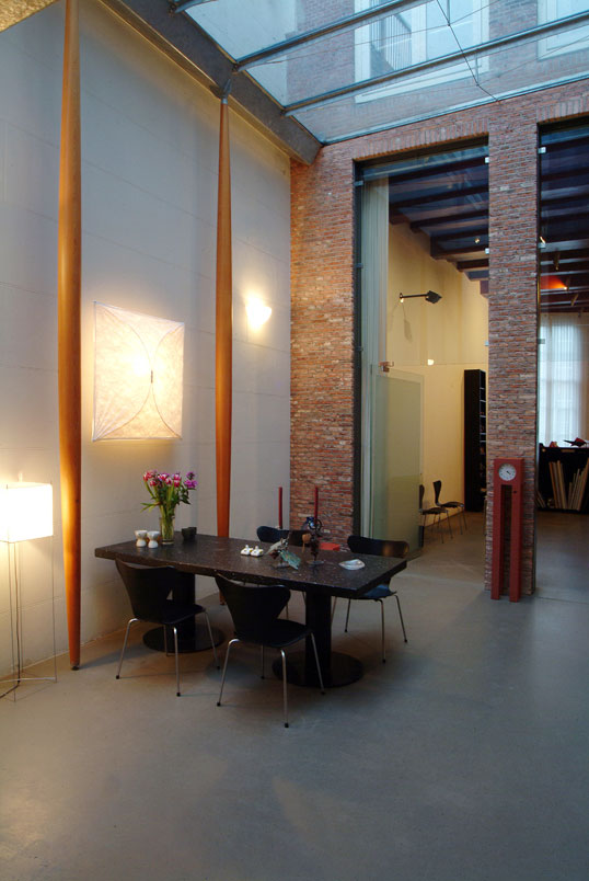
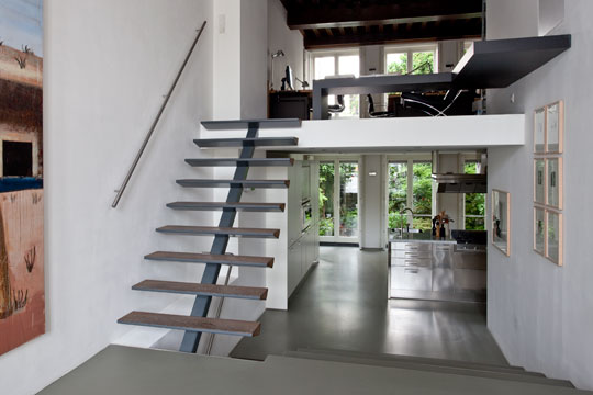
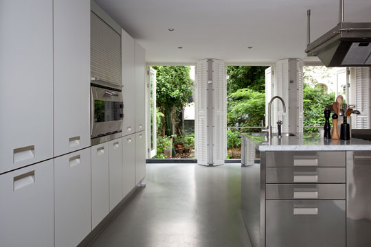
The interior design is consistent throughout all the floors with custom-made bookshelves, kitchens and wardrobes. On the ground floor, a row of pillars stand parallel to the wall of the neighboring house. These pillars made it possible to avoid using walls to support the house, and gives the relatively small corridor a generous space and identity. A light well that reaches the glass roof of the ground floor, provides the center of the house with additional light that reaches all floors. The house also has a great variation of light throughout the seasons and throughout the day, made possible due to the East-West orientation of the house.
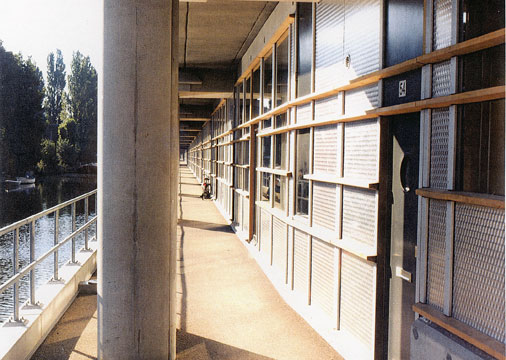
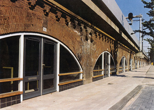
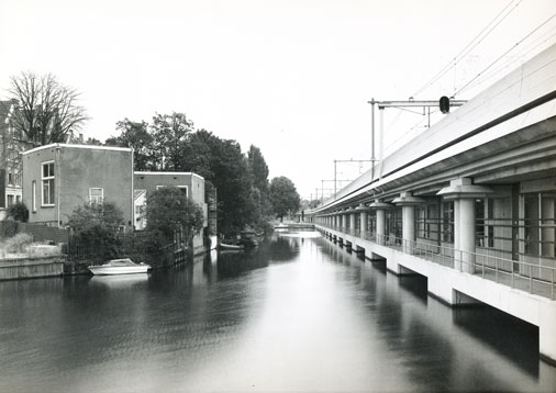
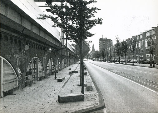
Offices and studio’s underneath a railway bridge. Commissioned by housing cooperation/ developer “Het Oosten”. (In co-operation with Anke Zeinstra).
more pictures
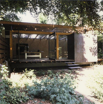
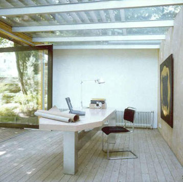
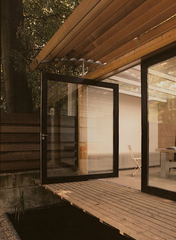
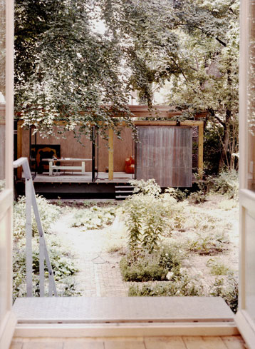
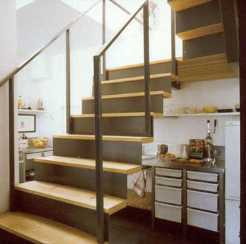
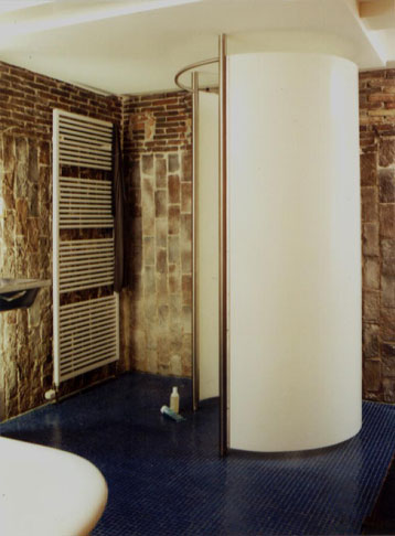
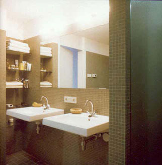
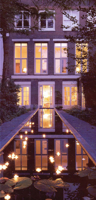
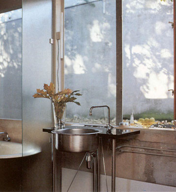
The house, situated in the back part of an 18th century Amsterdam canal house, is located on the Herengracht. It is inhabited by a writer and has a 9 by 30 meter garden. The interior of the house was designed in 1996 by Tijmen Ploeg who created custom-made solutions for the stairs, bathroom, toilet and kitchen. In 1998 he was commissioned to design a transparent garden pavilion to be used as a study and guest room.
The relationship between the house and the pavilion is very important for, together with the garden, they form a unified whole.
more pictures
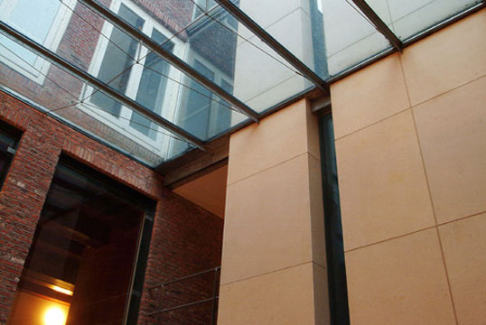
The five story house, a living and a working space for a painter and a writer, is located on an Amsterdam canal. The front house has been restored. The back house as well as the winter garden were newly designed and built.
more pictures
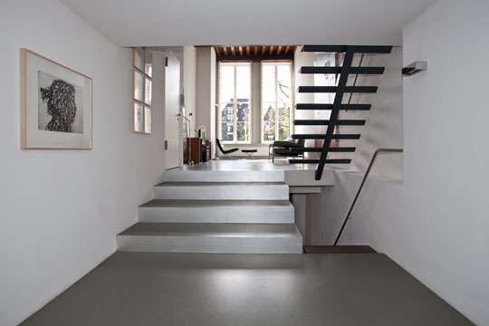
Not demolished but dismantled, reorganized and reorchestrated.
The distinctions between work, home and recreation were becoming blurred for the owners of this property. Theirflexible lifestyle asked for an environment where work and living could easily be combined.
more pictures
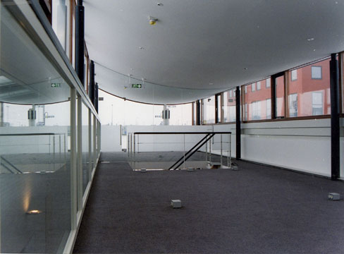
The building contains four sounds studios used primarily for recording film and television commercials. The entrance, conference room and administration are located in the central area. A small bar, a fitness room and a sauna are on the top floor. The client requested that all spaces, apart from the sound studios, receive as much daylight as possible. The facades reflect directly the sound studio's interior shape. All the studios are identical, yet each has an individual foundation to prevent sounds, which might negatively affect the recording, from penetrating into the studio from either outside the building or the adjacent studios.
more pictures
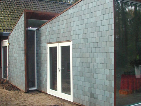
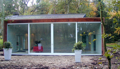
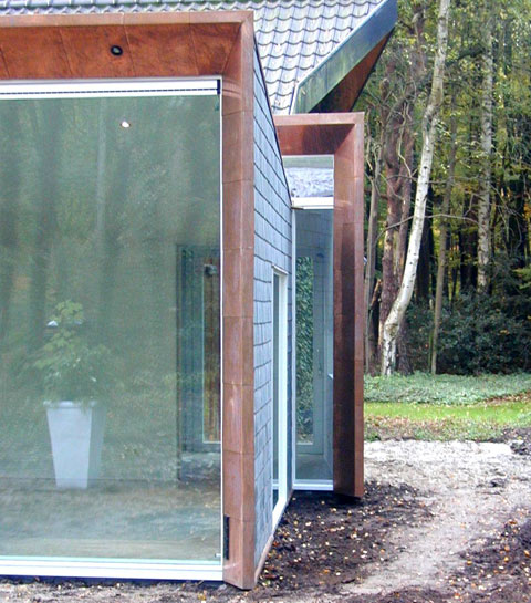
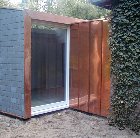
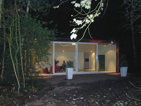
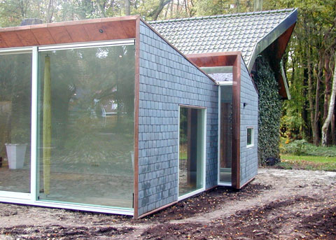
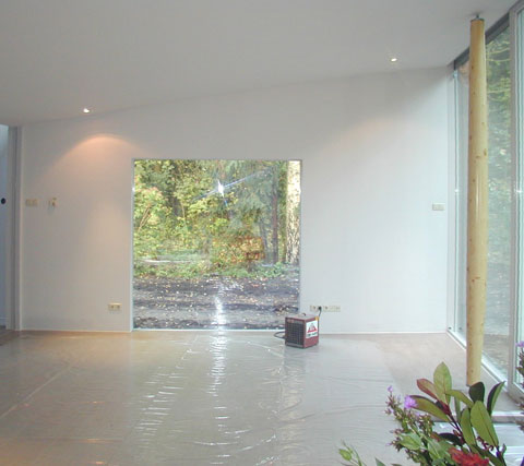
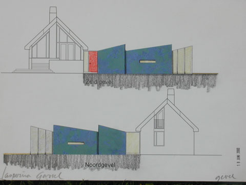
The client requested an extension for her vacation house which would make it possible to live there all year round. A new east wing extension to the house has been designed to include a salon and some private rooms. A new entrance connects old and new. Daylight was given special attention in the extension. The salon has a large glass front that allows an undisturbed exterior view of the terrace and the woods beyond. Slate covers the north and south sides of the extension.
more pictures
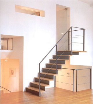
The Van Leeuwen/Van Asperen House is a canal house located in centre Amsterdam. Originally the house was divided in two by a thick wall. In redesigning this house, we created several cavities in the wall, through which we formed a new staircase around the house. Now there are different spaces in the house i.e., the living room, study, and salon, which interact fluidly with one another and allow for ease of movement. (The garden was designed by M. van Gessel).
more pictures
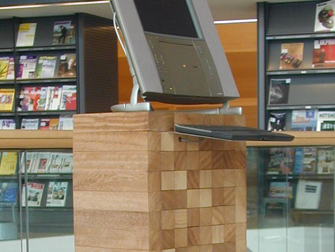
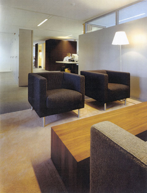
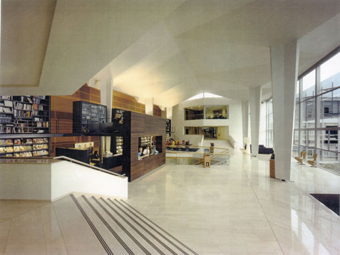
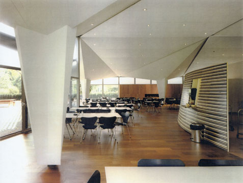
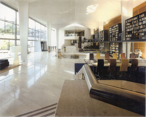
Interior of an advertisement agency consisting of 4.500 square meter office, a restaurant and an entrance hall with library.
(This project is in co-operation with Peter Sas.)
more pictures
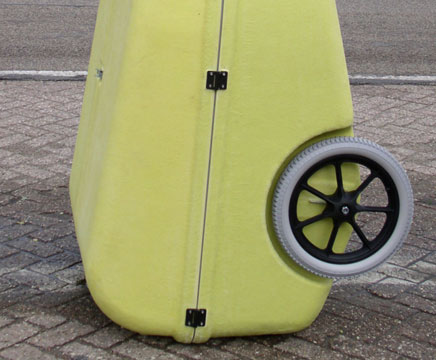
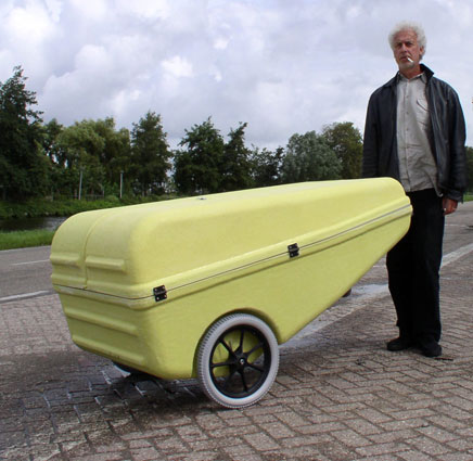
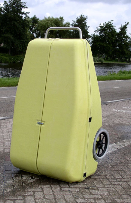
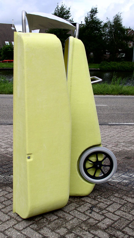
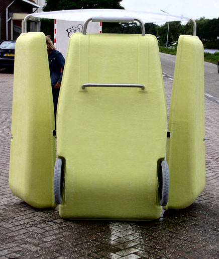
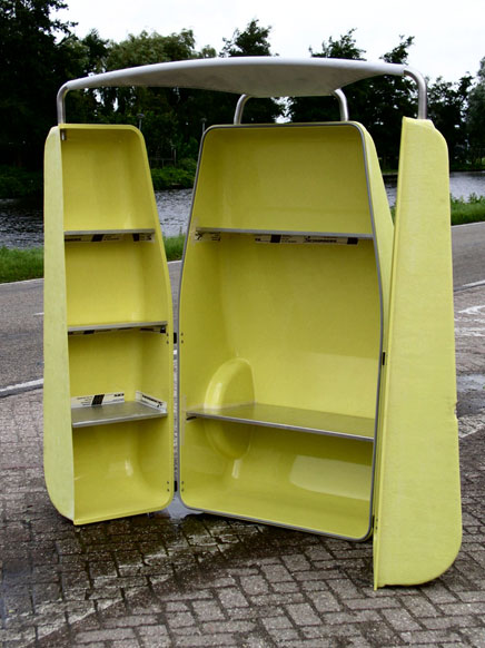
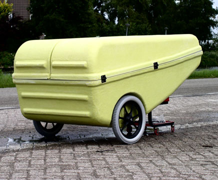
“It’s yellow and it sings”
An up-to-date- wheelbarrow. Originally designed for the homeless of Amsterdam to provide them with an mobile store to sell second hand clothes or books and other treasures.
The canary has found its way to the third world where it is put to use as ….well, as what not?
more pictures
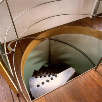
The house and studio of Tijmen Ploeg is a renovation of the one of the first concrete buildings of Amsterdam. The original concrete is still on sight in the interior. The exterior has been covered with isolation material and aluminium panels.
more pictures
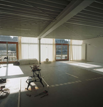
The studio for a fashion designer is a free standing building in the centre of Amsterdam, direct related to a canal.
more pictures
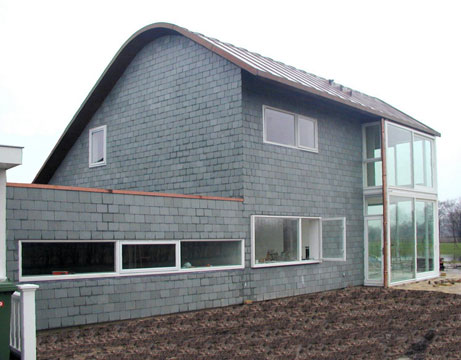
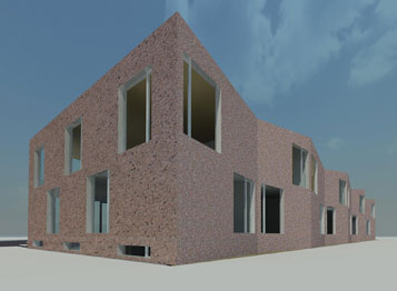
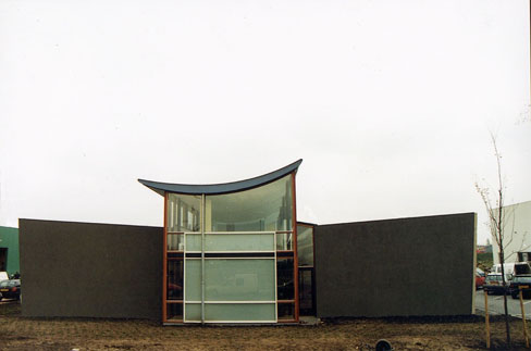
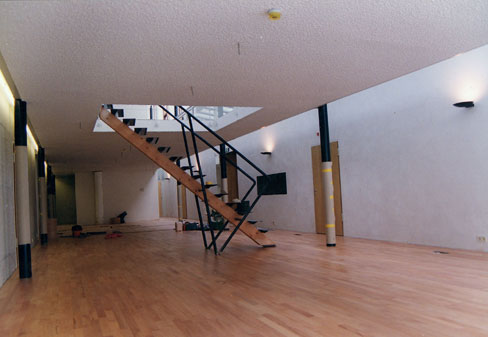
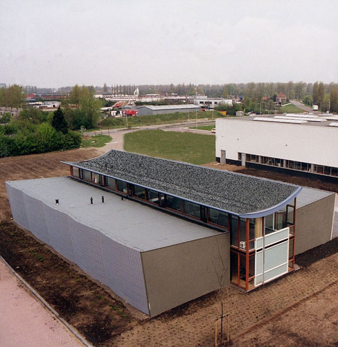
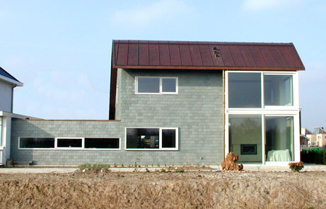
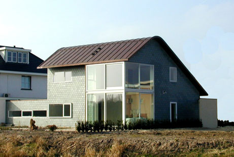
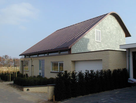
Located on the edge of a new district in an average street, the villa seems to hide behind a closed front. In this one extended wall the entrances to the house, the garden and the garage have been placed. The peak-shaped copper roof is constructed in a way that it appears to float above the wall. The interior of the ground floor, with the exception of the cloak room and stairs, is one large space. There is a door leading to the garden from the open kitchen. The garden’s main terrace is on the south side.
more pictures
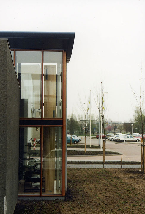
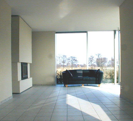
The moss-covered roof of the garage extends the garden optically. The southeastern corner, in the back of the house, has a glass extension on both levels which allows of an undisturbed view of adjacent meadows.
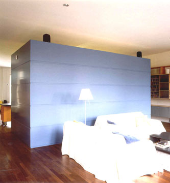
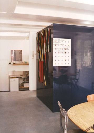
Renovation of an apartment in Amsterdam, formerly used as an office. The famous Dutch canals were drawn into the apartment by replacing the existing facade structure, thus becoming part of the living space as well as the public space outside. The living space is folded around the kitchen and bathing and sleeping area, allowing the light to flood throughout the apartment. This ensures a light and open character which is particularly desirable in an old building that is reincarnated for a new life.
